Useless User Manuals
- Posted by Kim Roth
- On January 12, 2016
- 0 Comments

A growing list of pet peeves is quite common as we go through life. New experiences bring new lists of annoyances. But few rank higher in my household than a useless user manual. Just ask my husband. You can almost see the steam coming out of his ears as he tries to figure out the instructions to hooking up our son’s new Xbox. What are some of the most exasperating user manual blunders?
Horrible Writing
University of Oxford’s Professor Richard Dawkins wrote a scathing review of an Amazon instruction manual calling it an “illiterate disgrace.” He went on to urge Amazon to “please hire somebody who knows how to write at least ONE human language, to write your instruction manuals.” Professor Dawkins has no doubt echoed the thoughts of many a user manual-reader throughout the nation, regardless of the product. Unfortunately, most user manuals make it extremely hard to find a simple answer to questions.
Confusing Design
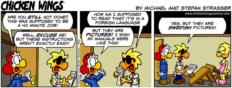
There are two common complaints when it comes to user manual design: They have too many pictures and not enough words; or too many words and not enough pictures. Ikea originated the model of “too many pictures and not enough words” so it could sell products worldwide. However, without words, a user manual may omit key steps. On the flip side, when there are too many words, readers become detectives, flipping from section to section, comparing tables and procedures in order to piece together the content and make some sense of it.
Online User Manuals
Sometimes manufacturers don’t include the user manuals in their product packaging at all, and only post them online. This saves them money, but it increases a consumer’s frustration. Too often, online manuals have too much information with very little organization or inadequate search tools, so you must scroll through pages of text to find what you need — if you’re lucky. Adding insult to injury, you must either read the manual online or print it out. But what if the product and your computer are in different rooms? And you’re sunk if you don’t have Wi-Fi access!
Bottom Line
As a manufacturer, you can’t afford to treat your user manual as an after-thought. The customer experience does not end at the purchasing phase. A happy and returning consumer must feel the value of their purchase up to and through the instructions. In order to eliminate user manual frustration, take the time to invest in clear instructions, great graphics, and a pleasing design. Consumers will be more engaged and more likely to recommend your product if the material is clear and easy to understand. For more information on producing Useful User Manuals, contact us.


0 Comments